Product Design
Designing Intuitive Dashboards for Teams
May 30, 2024
Introduction
Dashboards are powerful tools that help teams visualize, manage, and act on important information. However, when poorly designed, dashboards can overwhelm users, hide critical insights, and decrease productivity.
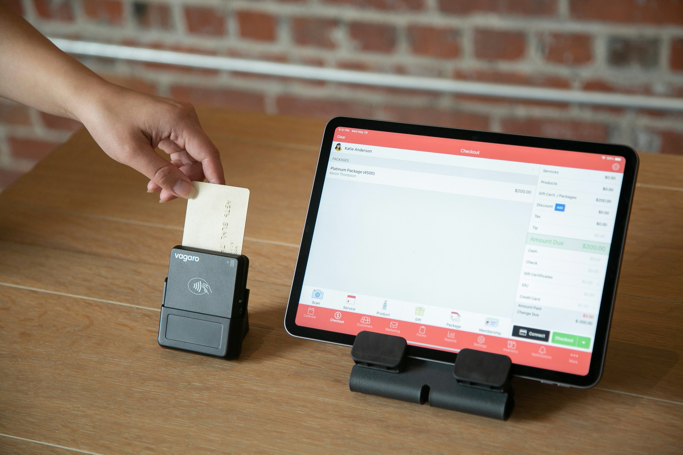
For a recent project, I was tasked with designing an intuitive dashboard for a project management tool. The goal was simple: provide teams with the information they need, at a glance, without unnecessary distractions.
In this blog, I’ll share my design process — from research to delivery — and highlight key principles for creating dashboards that are functional, clean, and user-friendly.
1. Understanding the Problem
Before diving into design, it’s crucial to identify the real problem. I started by understanding the users and their pain points through a combination of:
User Interviews: I spoke to project managers, team leads, and individual contributors to learn how they interact with dashboards.
Existing Product Audit: I reviewed the current dashboard and noted areas of friction, such as information overload and lack of visual hierarchy.
Competitor Analysis: I analyzed competitor dashboards to see what worked well and where improvements could be made.
Key Insight: “Users want a clean, high-level overview of project status, but they also need the option to drill down into specifics when necessary.”
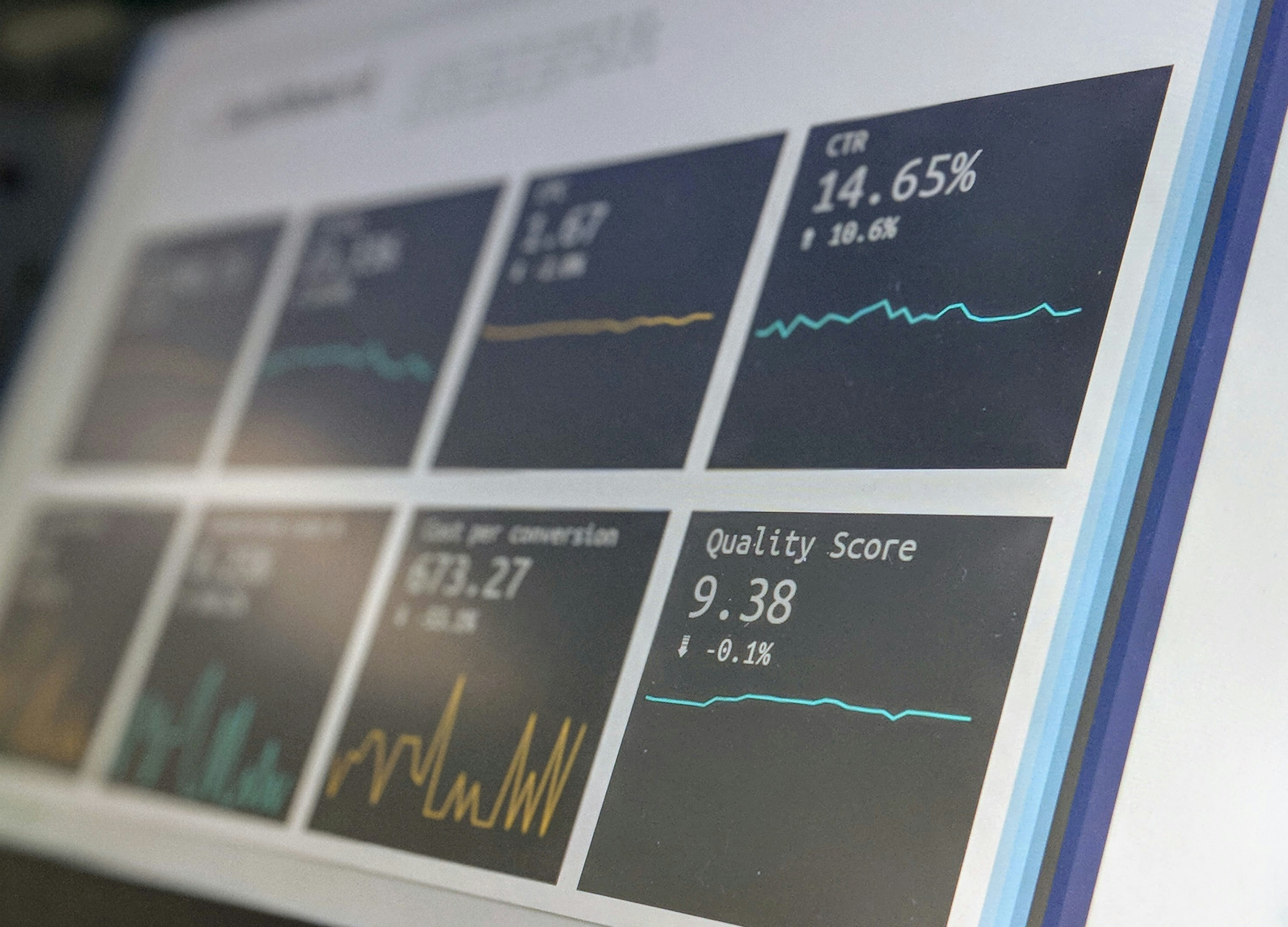
2. Structuring the Information
With the research insights in hand, I moved on to organizing the content. A dashboard must balance overview and detail, so the information architecture (IA) is critical.
Here’s how I structured the data:
Top-Level Metrics: Highlight key KPIs (e.g., task completion rate, project deadlines) at the top.
Quick Filters: Allow users to customize what they see based on teams, projects, or dates.
Drill-Down Insights: Offer interactive elements that reveal details when clicked (e.g., breakdowns of completed vs pending tasks).
I sketched wireframes to test different layouts, ensuring the dashboard felt intuitive and aligned with user goals.
3. Designing the Interface
Once the layout was finalized, I transitioned to creating high-fidelity designs.
Design Principles I Followed:
Visual Hierarchy: I used size, color, and spacing to highlight the most important information first.
Clean Aesthetics: I opted for a minimal design with ample white space to reduce cognitive load.
Accessibility: High contrast, clear typography, and legible data visualizations ensured everyone could use the dashboard effectively.
Tools Used: Figma for UI design and Framer for interactive prototyping.
4. Testing and Iterating
To validate the design, I conducted usability tests with real users:
Task Scenarios: I asked users to complete common tasks, like identifying overdue projects or team performance stats.
Feedback Loops: I noted areas where users got stuck or struggled to find information.
Results: Users found the dashboard easy to navigate and praised its clarity. Minor changes, such as refining labels and button placements, were made based on feedback.
5. Final Results
The redesigned dashboard delivered measurable improvements:
30% Faster Task Identification: Teams could now spot critical tasks and overdue items more quickly.
Increased Engagement: Users interacted with the dashboard more frequently due to its simplicity and clarity.
Conclusion
An intuitive dashboard doesn’t just display data — it empowers users to act on it. By focusing on user needs, a clean structure, and usability testing, I designed a tool that teams love using.
If you’re tackling a similar project or need help designing dashboards, let’s connect! I’d love to bring clarity and functionality to your product.